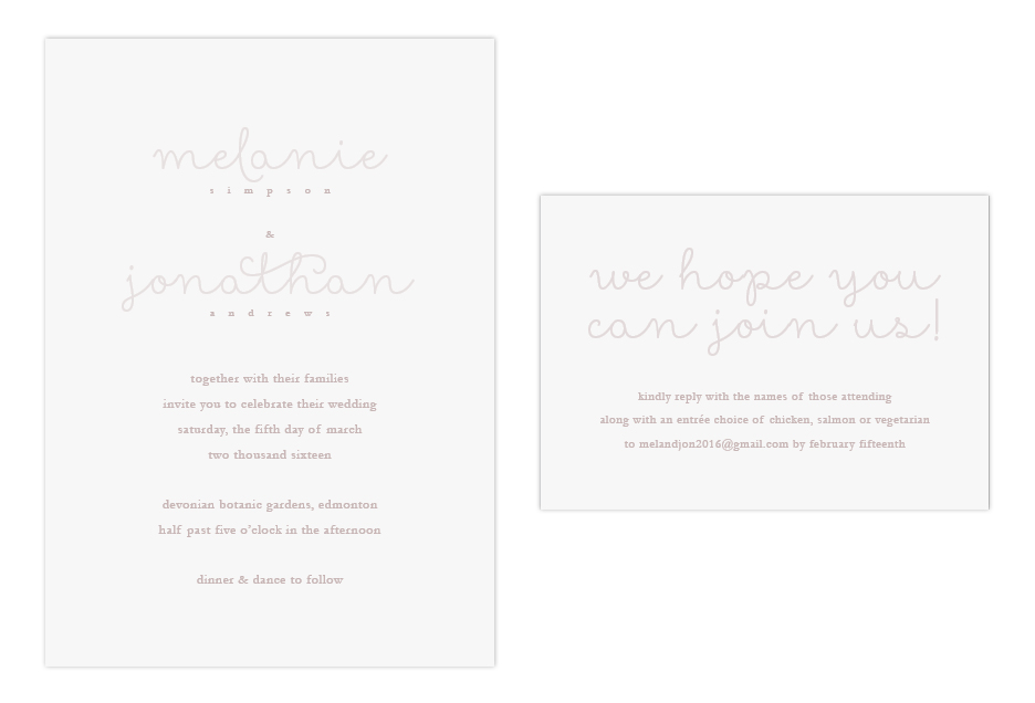
It’s not often that the words ‘minimal’ and ‘romantic’ are used together, but Melanie and Jonathan wanted just that: a soft and simple wedding invitation that was full of romance. Simplicity can still impress your wedding guests, and for this invitation the ‘wow’ factor was achieved with luxury paper.
Creating this look…
This couple opted for fewer pieces in their invitation suite to achieve the air of simplicity that they desired. With fewer pieces to design and print, there was room in the budget to splurge on a high quality paper. Choosing a high-quality paper with an eggshell or wove finish, rather than smooth, will give a little bit of texture to impress your guests as soon as they’ve got the wedding invitation in their hands.
For fonts, this invitation uses just two simple fonts that compliment each other nicely. First, there’s a modern script for names and headings, which is printed lighter to give some contrast to the design, and to create that soft, romantic look.
The second font was a serif, printed slightly darker, used for the date and location information. This ‘tone on tone’ print is a great way to add dimension without risking the invitation looking busy. When using this method, it’s a good idea to do a test print before printing all of your pieces. Colour on screen is very different than what comes out of a printer! The colours have to be perfect in order to get the tone on tone look just right, so be prepared to test it until it’s right.
Another way to add a little bit of elegance is to round the corners – it’s a very inexpensive way to make the invitation look extra fancy!
Finish off this design with the right envelope for the feel you’d like to achieve. A baronial (pointed) flap will give a classic touch, while a square flap will finish the look off with modern flair.


We love making new friends!