Blog

Local love: 5 Minute Face – Valéry Goulet

IMG_3107 If you’ve been following me for a while, you’ll know that I love unique wedding ideas and I love design (obviously!). Naturally, I’m excited to share this sweet local business with you: 5 Minute Face is an illustration booth for edmonton couples at their weddings, where guests can sit for 5 minutes and walk away with a creative and unique memento. Not only does it serve as fun and unique entertainment for your wedding, especially during cocktail hour, but the finished illustrations can double as a very special favour that your guests can take away from your wedding. (This is my portrait from my wedding <3)

The 5 Minute Face booth is owned and operated by Valéry Goulet , the owner of valérydesignwrks, a small multidisciplinary design studio in Edmonton. After years as an illustrator, and a few seasons showcasing her work at the Royal Bison Art and Craft Fair, Valéry devised a way to turn her vendor booth into something that was both creative and interactive: the 5 Minute Face booth was born.

The booth is set up on a small table, where Valéry sits on one side and her subject sits facing her, with a divider in between them. There is an 8” x 10” window, so they can see each other, but the subject can’t see the drawing in progress. Once the portrait is completed, she slides the print through a slot at the bottom of the booth.

Here’s a little bit more about Valéry, her love of illustration, and how you can incorporate her unique work at your wedding.

What interests you about illustration?
With illustration, I find every aspect of it interesting. I teach two illustration classes in both design programs at the U of A and Grant MacEwan. I go over a wide range of techniques and processes with my students. With this specific project (illustrative booth), what I find the most interesting is how everyone is truly unique and beautiful. This illustrative exercise impacted the way I see people and also the way I approach other illustration based project. Forcing me to illustrate without the ability to erase and refine is quite stressful and I love it.

How do people usually react when they receive their illustration?
Every time, I get a nice smile and a thank you. People are curious to know how they are perceived, I think, and it seems to please them to see my drawings.

What are some other ways that couples can incorporate your illustrations in their wedding?
There is a wide range of applications for couples to incorporate my illustrative work. I would be happy to provide them with illustrations in colour or black and white for their wedding invitations, thank you cards and any other collateral pieces. Illustrations can be printed and also engraved so it gives us a ton of options to choose from.

Where can people find the 5 Minute Face booth in action (when it’s not at a wedding)?
I mostly do private functions so it is quite hard to find my booth at a public event. However, once or twice a year, they might be able to find me at the Royal Bison Art and Craft Fair .
In Two Weeks I’ll Be A Mrs.

Bag I can’t believe the day is already here. I finally get to marry my best friend and celebrate with all of my friends and family.

You all know what that means. I will be unavailable to take on new projects until September 21. Please send me an email if you would like to inquire about a custom invitation or booking a consultation and I will respond as soon as I’m back in the office.

<3

Wedding Trends: Foil Stamping

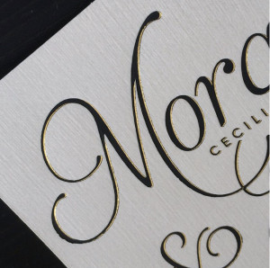
One of the most glamorous trends in wedding invitation is foil stamping. This technique creates a shimmering accent or even an entire invitation design that is metallic. This is a perfect way to incorporate on-trend colours like gold and rose gold, and a great way to make a wedding invitation more sophisticated.

Foil stamping can be done in practically any colour. I’ve found that most of my clients choose to stick with silver, black, or gold but I have also done blue, purple, and rose gold. Foil stamping can be done right here in Edmonton!

Here are a few ways to incorporate foil stamping and make an impression with your wedding invitations:

  • Monochrome
    Choosing a foil stamp in the same colour as the paper gives a contemporary and classy look. This look is achieved by choosing a matte paper, and using foil stamping in the same colour for the lettering.
  • Dots
    Clusters of dots on the edges of an invitation is great for couples who want to get their guests in the mood to celebrate – it’s just like confetti!
  • Script
    To achieve the glamour of foil stamping when you’re working with a timeless and romantic theme, use the metallic effect on delicate script text.
  • Drama
    Gold, silver or rose gold stamped on a deep colour, like burgundy or eggplant, creates an impressive and dramatic look.
  • foil stamp 3 Monogram
    Have your invitation designer create a custom monogram for you, and have it foil stamped throughout your wedding stationery. Who says you that custom monogram is only for your wedding day – once you’re married you can continue to use the design for custom stationery!
  • Drop Shadow
    By using the same plate with two different foil colours, you can create a shadowed effect.

What you need to know:

Foil stamping can be mixed with digital printing if you’d like more than one colour on your invitation. However, if your design is very delicate and precise you will have to use offset printing rather than digital, because foil and digital designs need to line up exactly. Offset printing is the original printing method, which is more expensive but much more precise in terms of alignment and colour.

Generally, a foil stamp is based per plate – and each unique design needs its own plate. This means you need at least one plate per card that you want foil stamped. It is common for couples to stamp the invitation and digitally print the additional cards in the stationery suite, which will save a little bit of the expense.

Another way to get more value out of your wedding invitation budget is to work with your designer to design a foil stamp plate that can be used on all of your cards – like a simple border design. Another option is to use the same plate with multiple colours to create a layered look or to incorporate every element of your wedding colour palette.

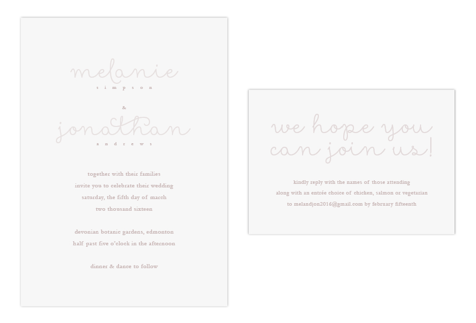
Featured Design: Melanie and Jonathan’s Romantic Minimal Wedding Invitation

It’s not often that the words ‘minimal’ and ‘romantic’ are used together, but Melanie and Jonathan wanted just that: a soft and simple wedding invitation that was full of romance. Simplicity can still impress your wedding guests, and for this invitation the ‘wow’ factor was achieved with luxury paper.

invite

Creating this look…

This couple opted for fewer pieces in their invitation suite to achieve the air of simplicity that they desired. With fewer pieces to design and print, there was room in the budget to splurge on a high quality paper. Choosing a high-quality paper with an eggshell or wove finish, rather than smooth, will give a little bit of texture to impress your guests as soon as they’ve got the wedding invitation in their hands.

For fonts, this invitation uses just two simple fonts that compliment each other nicely. First, there’s a modern script for names and headings, which is printed lighter to give some contrast to the design, and to create that soft, romantic look.

The second font was a serif, printed slightly darker, used for the date and location information. This ‘tone on tone’ print is a great way to add dimension without risking the invitation looking busy. When using this method, it’s a good idea to do a test print before printing all of your pieces. Colour on screen is very different than what comes out of a printer!  The colours have to be perfect in order to get the tone on tone look just right, so be prepared to test it until it’s right.

Another way to add a little bit of elegance is to round the corners – it’s a very inexpensive way to make the invitation look extra fancy!

Finish off this design with the right envelope for the feel you’d like to achieve. A baronial (pointed) flap will give a classic touch, while a square flap will finish the look off with modern flair.

Location

Based in Alberta, Canada

Contact Nicole at [email protected]